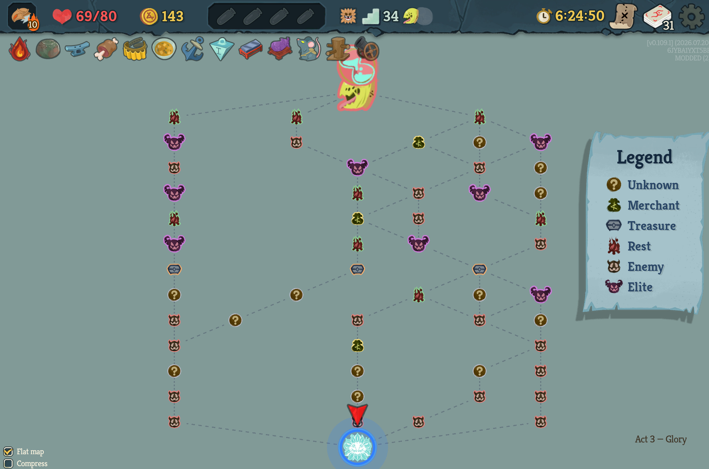
Okay, the above is my new version. I undid a few of the visual changes which snuck in. I think they were fine, but it's better to align as much as possible to the original I think.
Here is what the original (top part) looks like. To see this you would need to have scrolled up quite a bit to see it.
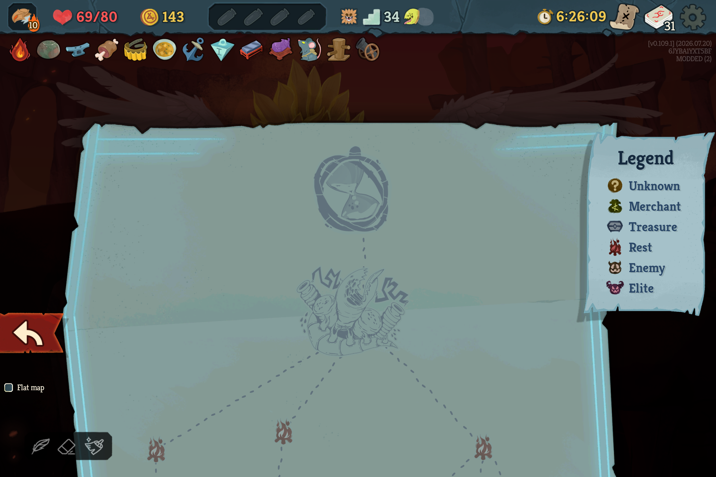
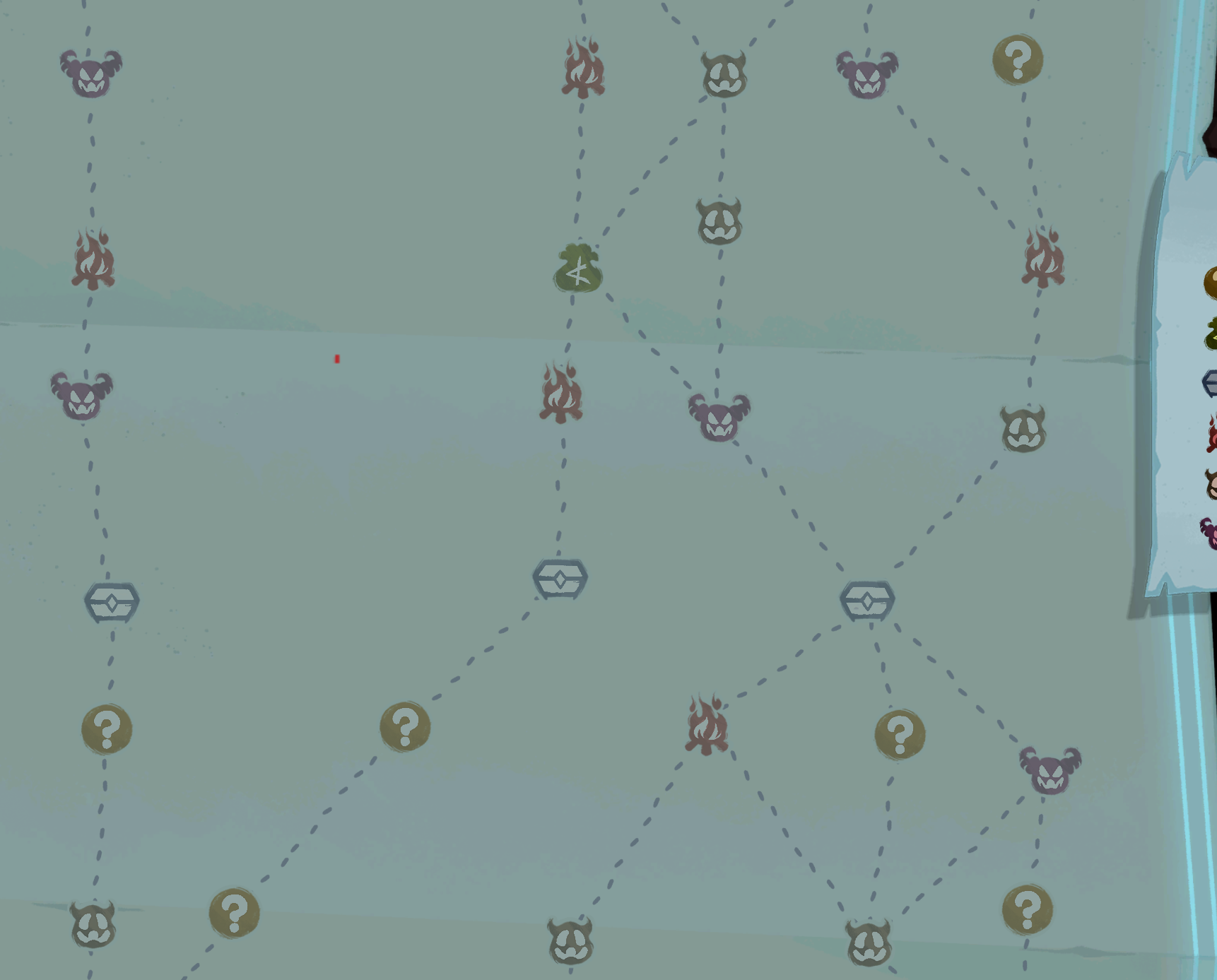
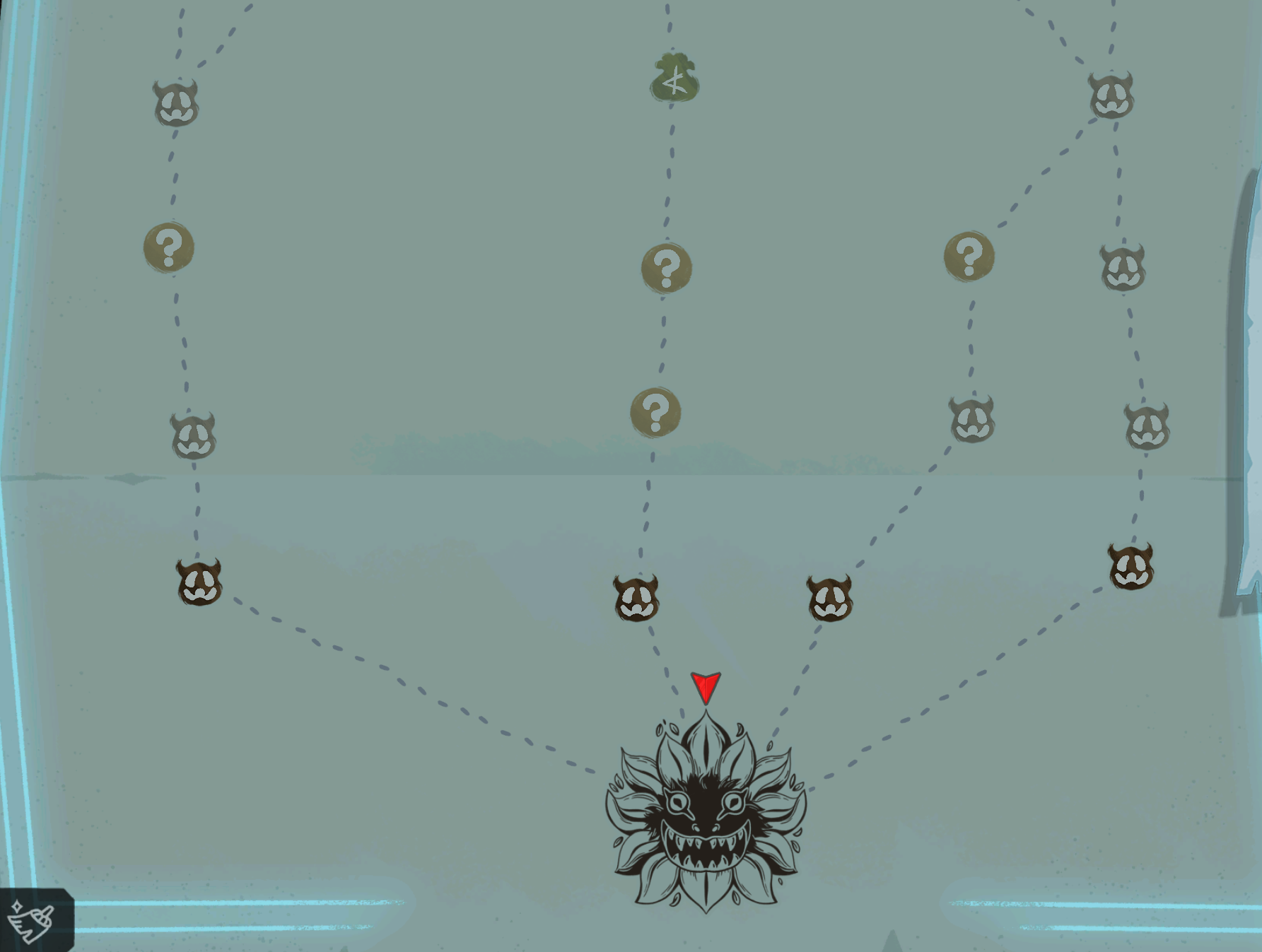
Overall the question is: why would this otherwise brilliant game (in so many ways) make the map like this? Such that it's so dark and dim that it's genuinely difficult to see enough of it to path or really see and comfortably consider what your options really are?
Why?
First I want state that a core belief of mine is that humans strongest skill is our ability to rationalize. So you can tell people things about an imaginary society and then ask why they might do things that way, and people will infinitely be able to rationalize and defend their imagination. It's nearly impossible for someone just to say something more like "Well, they're making a mistake".
But, does that apply here?
Hmm, the best reasons I've heard for this and the exact same issue, where the deckview also starts way too zoomed in
Best Technical reason: small screens mean that it's better to make players scroll than to make things too small to see or read (in the case of cards, & this is important!)
Best Deep reason: That it's somehow "better" for you, as a player, to be forced to memorize or semimemorize the map, and your deck of cards, to make you more of a real player.
The attacks on these hypocricy write themselves: * Actually, forcing people to do this won't really strengthen their skill. But it will still survive as a reason because 1) nobody wants to admit they're lazy 2) it sounds cool
WIP. But anyway, that's it. The overzoom has afaict always been present in both. I think just as easily the creators could say "oh true, thanks, weforgot to undo that since the early days when it was made artibrarily for no longer valid techincal reasons" as "oh no, this is vital". Next step, obviously, is to ask for proof how they know THIS is the right level of map and deck obfuscation to do to users (rathern than zooming in even more!)
We shall see, though.
Info about an idea I had to compress the map somewhat.
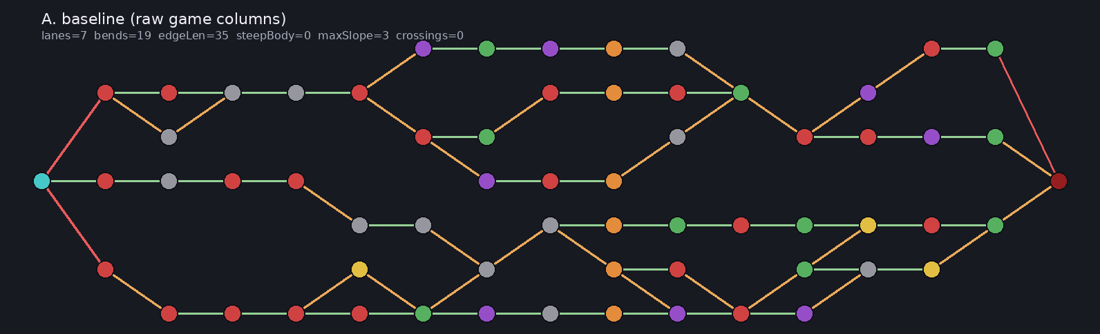
The default map looks like this:
You can't see all of it at once! You have to scroll up to get the entire thing in view. This is a bit annoying. Also, there's no color used. There is mouesover on the legend which explains the node types.
I've been making a mod to improve this. First choice: make it sideways.
That works fairly well. Image 1:
But then i got annoyed that sometimes it's needlessly tall so I've been working on various methods of vertically compressing it.
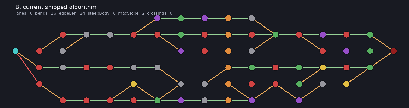
This is the non-compressed, just normal map.
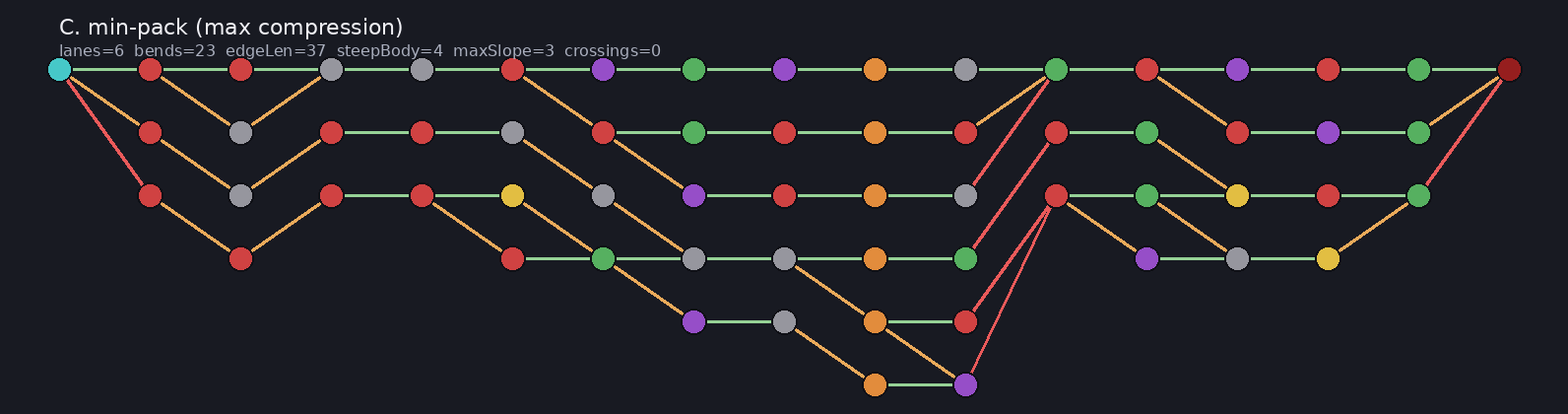
This is the "compressed upwards" version, not good.
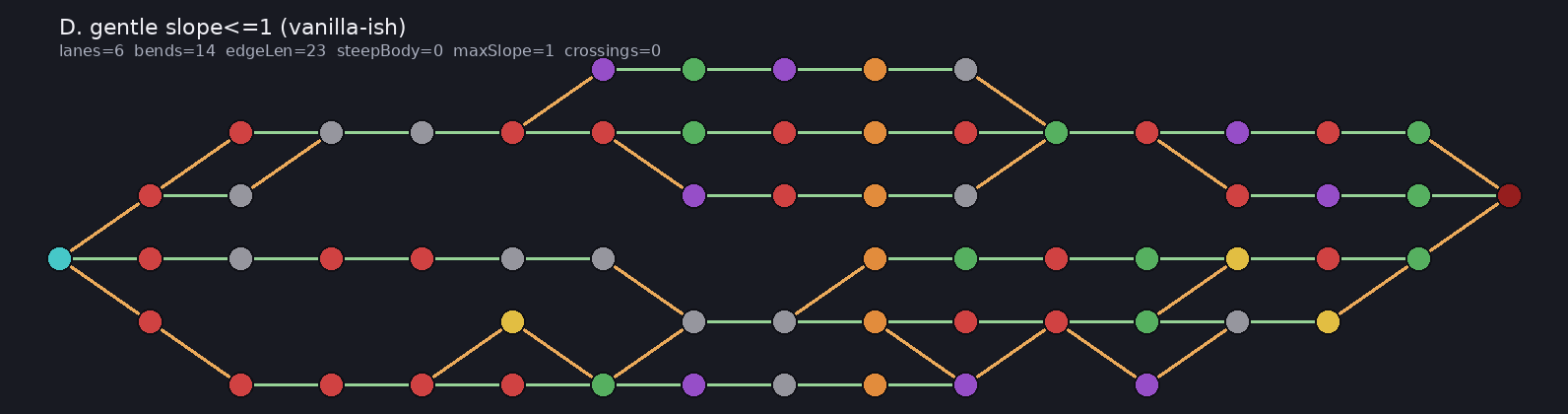
This is a nicer type of compression.
... I need an image flipper here - something which takes two input images then makes a ui where we can flip between them very quickly, left/right to kind of compare physically. perhaps a kind of alignment system within them too so that when i'm making it i can set the fixed points between them?