Which visual style turns out to result in me getting better scores?
Original Version
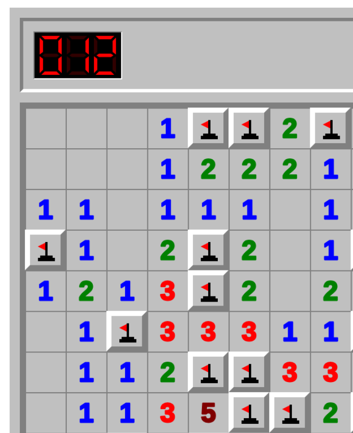
Next Version
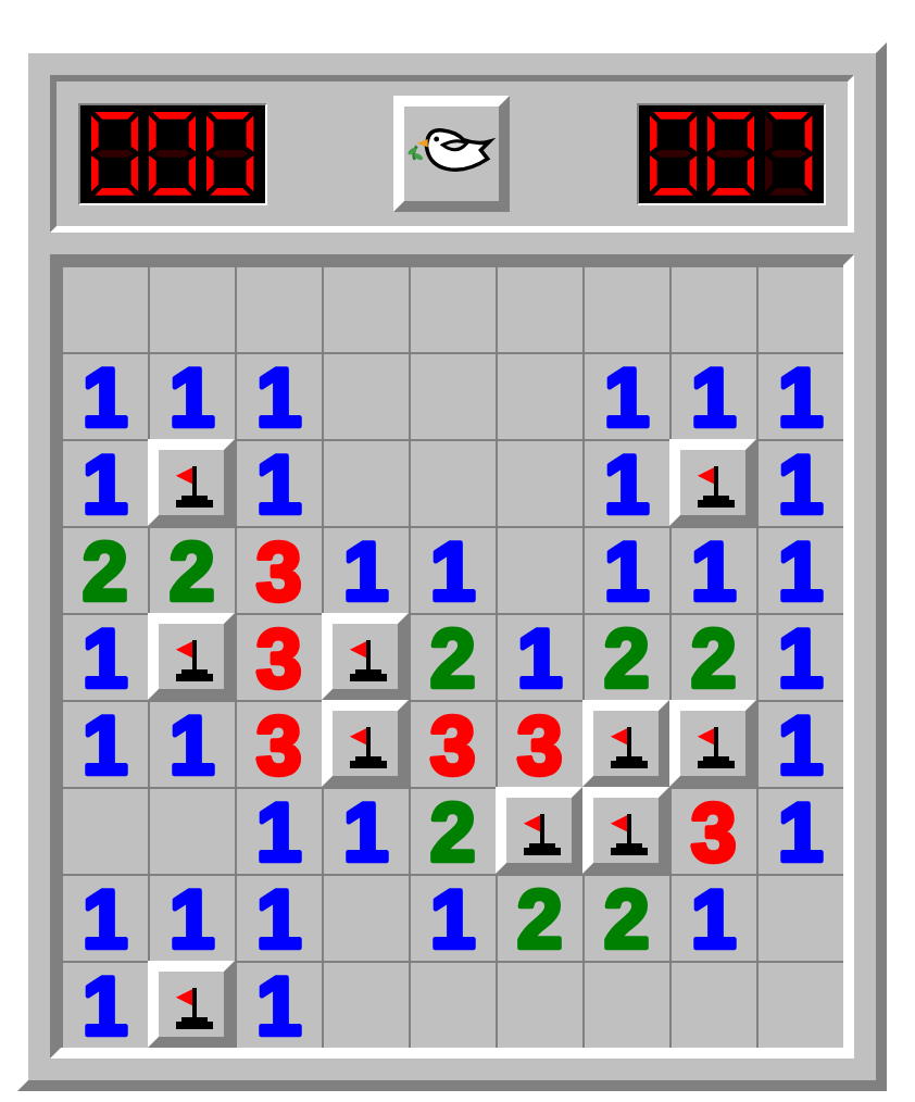
Answer: the 2nd one. Maybe it's just because of my imperfect vision, but it's MUCH easier to play and concentrate when using the more filled up tile-style of lettering.
This reminds me of the (still unaccomplished) goal of the "set party" i had once - we made and played with a bunch of variant visual designs of the game "set" at a party! The original goal was to find the set which was ideal for humans. ofc that will actually vary by person, training, interest etc. But still: I will claim that the default game is not very close at all to optimized for human play!
Next steps.
Obviously, I can't just stop here. I think the next problem is that the mine indicator is also not-very visually available.
And since the project itself is based around the same thing - using human playing speed and behavior as a way to measure themselves, we can also do the reverse: within a session, or among a set of players, iterate through multiple design styles and see if any of them cause different outcomes!